The Plurality and Uniformity of Dov Ben David
Is it possible that effusive creativity and never-ending curiosity are the reasons that stood in Dov Ben David’s way from developing one homogenous artistic expression? Is it possible that having numerous technical skills and virtuosity in controlling various forms of expressions are the reasons responsible for presenting his extensive body of work in multi-disciplinary and stylistically mixed fashions? Or, perhaps were those the ever-present and demanding practical obligations to shows, movies, plays, etc., that left him no choice but to demonstrate his design versatility? I believe that all the answers are correct and some of them even help to explain his indetermination with artistic and consistent syntax within the realm of painting, where he kept putting on different masks, all well-made, delivering great talent that refuses to freeze in time and defies the idea of "oneness".
He started painting in 1947, a 20 years young fellow, in a refugee camp in Salzburg, Austria. Most of the time he drew; in an ink drawing from 1949, a year after he moved to Israel and joined the "Palmach”, he delivers in a most figurative way a nocturnal image of a coffee house or a cabaret. Ben David carried onward his passion and talent entering into the Avni Art Institute in Tel Aviv, where he studied painting for a couple of years during the years 1954-1956. The Avni Institute during those days was regarded as the stronghold of Israeli abstract expression; it was the academic branch of the group “New Horizons” that was at the peak of its existence. Accordingly, his instructors – Shtreichman, Stimatzki, Yanko and Mokdi (who was not a member in the group) expressed their art in a most abstract fashion and it is likely that they guided and bestowed upon their young student the charms of abstract painting that will permeate and be seen throughout his work, even when depicted in a semi-figurative form.
The worshipping of Parisian Abstractionism
by New Horizons during the years 1940-1950 will shed light and clarify the departure of Dov Ben David to Paris, alongside a few other young Israeli artists who arrived in the city of lights during that era (Michael Argov, Lea Nickel, David Lan-Bar and others). With the help of German reparation funds he enrolled at the Fine Arts Academy for the following one and a half years while becoming fluent in the native jargon of modern Paris.
A painting of a Paris landscape from that time – an autumn representation, grey and misty look of the city buildings, the Seine River, trees with falling leaves and a bridge – deliver a sense of gloom and melancholic lyricism which could have been just a personal reflection of the young artist’s disposition or maybe were just a façade of a Parisian romantic adaptation. Be it as it may, the foggy monochromatic form narrows the distance between the figurative and the abstract while confirming a strong aesthetic sensitivity.

Ben David’s paintings from the Paris experience show a connection between figurative representation and abstract one, while maintaining a clear emphasis for composition and color (drawings were neglected to a certain degree, although he did manage to produce some spontaneous figurative drawings later to be shown alongside oil paintings in his first exhibition at The Artists House in Jerusalem, 1960. Respectively, it is worth mentioning drawings he made for a 1959 Berthold Brecht song book, drawings that show similarity to social realism. Reviewing it from that aspect, the rift between painting and drawing has already been made, not to say abstract and realism, give away the plurality symptom of his work).
Oil paintings on canvas from the Paris period were populated with background textures of two dimensional surfaces (geometric squares), color saturated (done with a palette knife and brush), and some stylish flat figure at the center – most of the time of a nude woman, powerful and semi-mythical. Even though Ben David did not veer from the mainstream repertoire – Paris landscapes, female nudity etc., - the paintings are homogenous and exhibit a dramatic presence intertwined with intense display of colors. The surface textures show a strong attraction to the French abstracts of Nicolas De Staël and Serge Poliakoff – two of the painters who influenced the work of “New Horizons” group of painters. Thus, the painting “Boats on the Siene”, despite its frequent touristic use, confirms Ben David’s fascination with abstract painting: the sky, the river, even the boats themselves – all are formulated with the same textures of two-dimensional color surfaces.
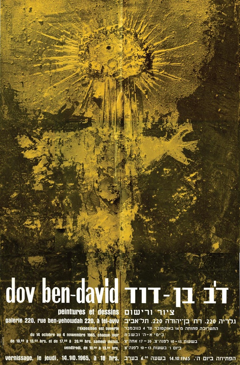
The show at The Artists House in Jerusalem displayed the product of Dov Ben David’s Paris period. But, five years later, 1965, in a second solo show at the “Galeria 220” in Tel Aviv, he reemerged in a totally new identity: now displaying material abstracts in polyester spiced up with collage and assembly of wire, sand, screws, mesh, corrugated carton, newspaper and more.
Ben David’s abstract approach – still not giving up primitive figurative metaphors of children, king, “prophet”, “Byzantine image”, animals and more – adopted the narrative of Antonio Tapies , joining a group of Israeli artists that since 1960 were following the Spanish artist’s footsteps – Yigal Tumarkin, Ika Brawn, Yehuda Ben Yehuda and others. Ben David’s new paintings were embedded with monochromatic metallic colors, where the primitive figure (as usual with Ben David, a single centralized and somewhat totemic image) appears on a semi-relieved background of rugged shredded material.
Let the truth be told: the Israeli critique for the most part was not accommodating in its approach towards Dov Ben David’s work. Throughout his journey as a painter he had to deal with reservations relating to form and content, and despite the fact that he won a favorable mention in a Parisian newspaper and even the top most award at an exhibition honoring Adolf Neumann (Paris, 1962), Ben David the painter never received the blessing and encouragement that he deserved from the Israeli press. In 1965, already a 38 years old artist, most likely envious with the new generation of artists belonging to the “Ten Plus” group making a name for themselves all around with their mischievous shows. It is also reasonable to assume that he had to come to terms with his own financial situation as far as his family livelihood was concerned. Having worked as a graphic designer and a set designer for theatre, he obtained a position with the fledgling Israeli TV in 1968 as a set designer. Always drawn to innovative techniques, he had no problems getting accustomed to the idea of dual existence between free and applied art.
He acquired his fame at his work with the Israeli TV. With great excitement and a vital urge to playfully create and invent, he managed to produce throughout the next twenty to thirty years a plethora of sets expressing joie de vivre and an unlimited freedom of expression: the first ever TV set – a background for the Hannah Robinah story telling (“The Silver Plate”) – made of ruptured metallic found objects that he collected at the nearby junk yard, a possible remnant of his abstract painting period. Only later, following a course work he attended abroad for television set designs did he devote himself to geometric, kinetic and modular designs. Accordingly, sets he designed during the 70’s-80’s for the Eurovision song contest and a few other sport and entertainment events resumed their geometric and kinetic abstract form. It never prevented him from designing a figurative background of two parallel lines of deciduous trees for the “TeleStav” show. Frequently, while designing children shows, he blended abstract geometric forms with folk and mythical images. Accordingly, he knew how to approach theatre sets with concise and implied realism (“My Town”, Shmo Holech Le’fanav”, and more), or stylish classism (i.e. the opera “Medea“, the musical “Joseph and the Multi-Striped Gown”). Going beyond his ability to produce profuse number of ideas like a designer who keeps pulling rabbits out of a hat, lays a clear artistically linguistic preference: abstract constrain, somewhat graphical, of simple forms, multiplied and\or emphatically emphasizing a variety of colors and lights. Likewise, was his inclination while exhibiting his “photo-painting” work at the Amalya Arbel Gallery in Tel Aviv, 1979 – slide projections of images made of shimmering arrays of lights, colors and primal geometrical shapes. A reminder: during that time, the work of Haifa artist P.K. Henich showing abstract and kinetic lights and colors became known. In any event, Ben David’s curiosity to experience new mediums is quite clear, as is the synthesis he found between “painting” and his compositions in television (object, light, movement).

From a broader Israeli-cultural viewing point, a greater comparison is self-evident between the language of abstract set designs – geometric and multi–colored (with “impressions” and neon inscriptions or without them) of Dov Ben David’s to the language of graphic design belonging in the 1970’s, such as Dan Reisinger, winner of the Israel Award. Similarly, the basic values in Reisinger’s designs – rich with clean geometric colorful forms – fall on Ben David’s set designs as far as the “Playing Man” principals (Yohan Hoizinge), form and material playful unity (Fredrich Schiller) and “The Free Game of Consciousness Powers”, Emanual Kant’s definition to the experience of beauty.
I never knew Dov Ben David, but I suppose, that in the free form game, even if rational and sane, he managed to finally find his homogenous creative place, a place open for various “places” allowing his creative intuition to get stronger with time. Then, who is Dov Ben David? In an interview with a journalist in the 1980’s he defined himself as: “I am a painter and a set designer, I experiment a lot, invent ideas and work hard, very hard…”